
Drowzee, Galarian Slowking V and Baxcalibur offer three ways into Komiya’s crowded, colorful scenes and a more personal artist collection.
Drowzee is asleep on a bench, but almost nothing else in the picture feels still. A Ferris wheel fills the distance, red shapes crowd the foreground, and the sky seems to ripple through several colors at once. The resting Pokémon becomes an island of quiet in an image that keeps pulling the eye elsewhere.
That contrast offers a good way into Tomokazu Komiya's work. Start with what the picture does to your attention. The illustrator credit confirms who made it; your response to the scene determines whether you want to keep looking.
Three English cards make a compact starting group: Drowzee 210/198 from Scarlet & Violet, Galarian Slowking V 179/198 from Chilling Reign, and Baxcalibur 210/193 from Paldea Evolved. The illustrator line visible on each card credits Komiya. Together, they offer very different arrangements of crowded space, strong color and character expression.
Begin with the credit, then look past it
An artist collection benefits from a more deliberate search than a character collection. A Pokémon's name will not tell you who illustrated a particular version, and a shared collector number across unrelated sets tells you even less. Read the credit on the actual card image and preserve the complete set identity.
This is especially important when a card has several illustrations. The version in your binder should be the one you researched, not another printing retrieved by a broad name search. A checklist that includes set, number, language and artwork gives you a reliable foundation before you decide how expansive the collection should become.
Komiya's own comments provide a little context without dictating a response. In an official conversation with fellow illustrator Kouki Saitou, he describes trying a more conventional illustration style before returning to his own approach. He also discusses working with acrylic gouache and other drawing materials. The interview is worth reading for the artists' explanations in their own setting; it should not be mistaken for a new interview conducted for this article.
You do not need a biography or a market ranking to begin looking closely. The cards provide the first evidence of what interests you.
Drowzee places the action around the subject
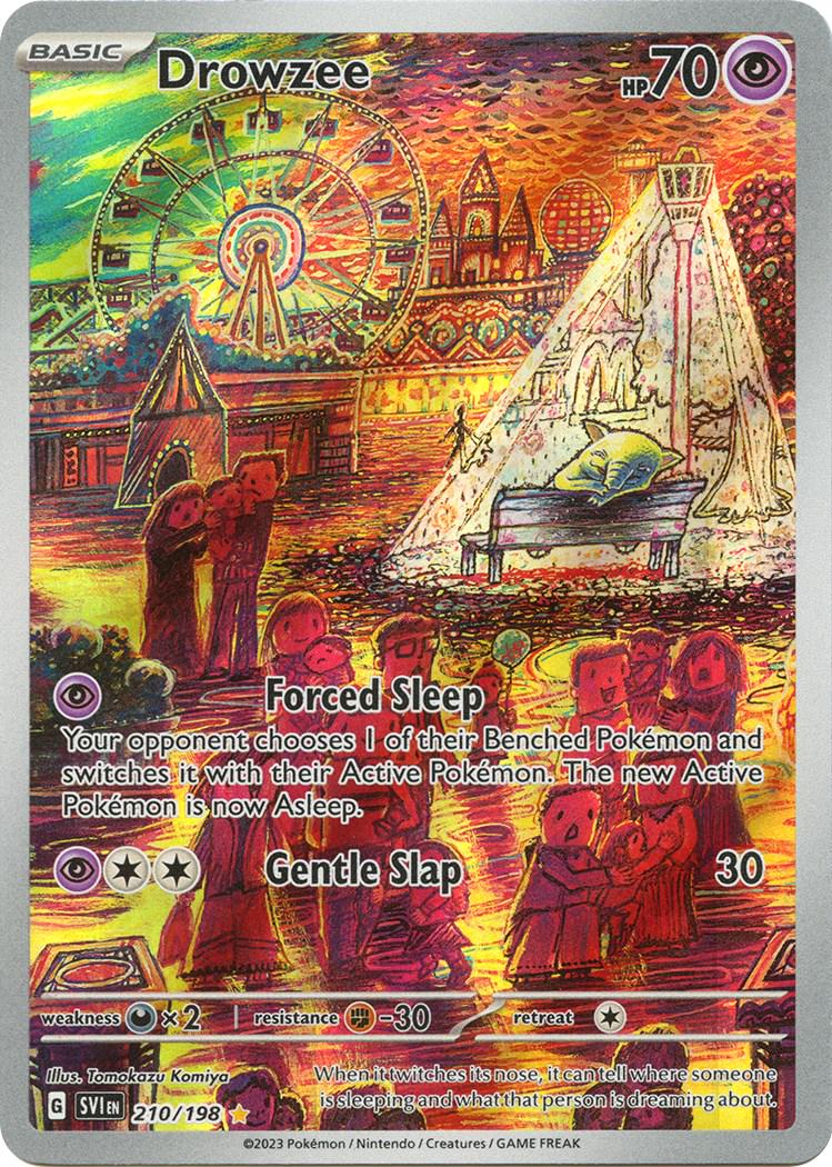
Illustration: Tomokazu Komiya
Catalogue image
On the selected Drowzee, the Pokémon is a relatively small presence beside the attractions and foreground shapes. The bench and the pale structure above it create a recognizable resting place, while the surrounding reds, yellows and greens make the environment feel restless.
That arrangement rewards looking in stages. First locate Drowzee. Then follow the large wheel and the pale diagonal structure. Finally, return to the small sleeping figure. The scene can feel busy and calm at the same time because the subject's pose differs so strongly from the activity of the surrounding marks.
This is a visual reading, not a claim about Komiya's intended story. The image does not need an invented account of what happened before or after the moment shown. Its visible arrangement already gives a collector something specific to notice.
For a binder page, consider placing it beside another picture with a small subject in a large environment. The connection can be compositional rather than chronological. It gives you a reason to choose the neighboring card that survives a change in market prices.
Galarian Slowking fills the space differently
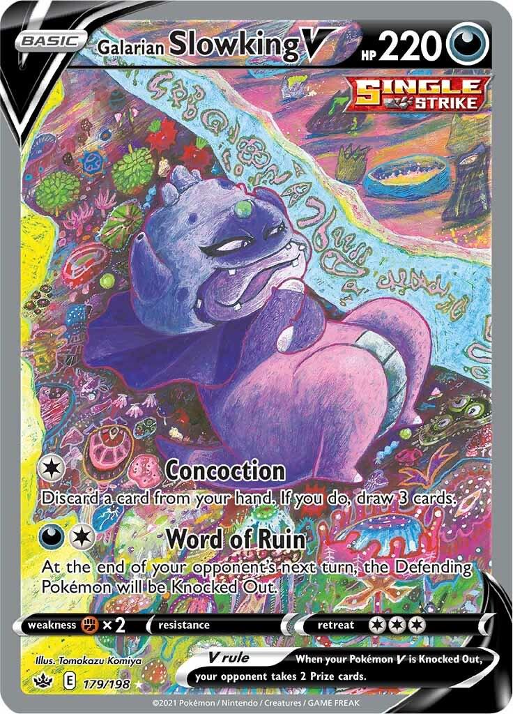
Illustration: Tomokazu Komiya
Catalogue image
The selected Galarian Slowking V moves much closer to its subject. The large pink body and dark head dominate the center, surrounded by bright patterns and curious background forms. The figure leans through the composition rather than resting at a distance from it.
Look at the eyes and mouth before exploring the background. The expression gives the image a particular mood, but there is room for different readings of that mood. A collector might find it amused, suspicious or faintly unsettling. Those responses are interpretations of visible features, not factual claims about a hidden narrative.
Beside Drowzee, the contrast becomes useful. Both pictures contain plenty to inspect, but they distribute attention differently. One asks you to find the Pokémon within a scene; the other places the Pokémon directly in your way and makes the surroundings compete around it.
That is the kind of relationship an artist binder can preserve. Instead of treating every page as a row of independent trophies, let neighboring cards reveal differences within the artist's work. The comparison makes the collection more interesting to revisit.
Baxcalibur turns the page into motion
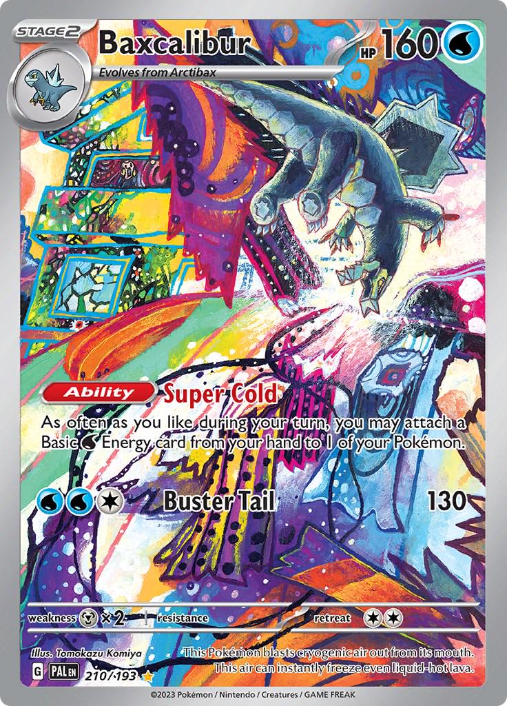
Illustration: Tomokazu Komiya
Catalogue image
Baxcalibur's composition is full of diagonals. The Pokémon's body hangs across a bright, crowded setting; pale shapes cut through darker areas, while yellow, purple, blue and orange passages compete for attention. Angular objects around the figure make the space feel unstable in an engaging way.
Try following a line through the picture without immediately returning to the name at the top. The eye can move from the body to the pale central area, then outward into the colored structures. The image offers several routes rather than one quiet focal point.
Against Drowzee's resting pose, Baxcalibur reads as energetic. Against Slowking's large central presence, it feels more entangled with its surroundings. These are useful differences to build a page around. You do not need to describe all three cards with the same adjective simply because they share an illustrator.
The complete collector numbers are also a helpful reminder: Drowzee and Baxcalibur both carry 210, but belong to different sets with different denominators. Saving only the short number would lose the distinction your collection depends on.
Give the collection a rule you enjoy following
An artist collection can expand in several directions. You might choose one example per illustration, concentrate on a preferred era, or build small groups around mood and composition. Decide whether language variants and different finishes count as separate collecting goals before adding them to a checklist.
There is no need to start by attempting a complete lifetime catalogue. A small group with a clear relationship can be satisfying on its own. Leave room to change the arrangement as you discover another image that makes the existing cards look different.
When considering a purchase, inspect the exact version and the condition of the offered copy. The artist credit explains the connection, but it does not make every listing interchangeable. Nor does appreciation of an illustration require a claim about its future price.
The strongest reason to keep these three together is visible on the page. Drowzee invites a search through a restless scene, Slowking confronts the viewer, and Baxcalibur sends the eye across a field of motion. An artist's name becomes more meaningful when the binder gives you a way to see those differences for yourself.
 The Next Grail Magazine